

2025
The Coffee Bomb Standee
The Coffee Bomb Standee
Garston, NZ
The Coffee Bomb Standee
A quirky face cutout standee for The Coffee Bomb, a coffee shop in Garston, NZ, designed while I was at Vital Signs. The client wanted something kid-friendly that carried the shop's brand identity in an illustrative style.
Digital Illustration
Signage Graphics


Challenge
Three face holes had to sit where kids could comfortably stand and poke their heads through, without disrupting the illustration. The scene is a chaotic kitchen, so any hole in the wrong spot could break the composition or look like a mistake.
Strategy
I planned the face positions first and built the illustration around them, so each hole lands on a character body or scene element that makes sense. A giant bomb, a nod to the shop's name, acts as a clipping mask for the whole kitchen scene, which keeps the busy artwork contained and gives the standee a strong, recognisable shape. The finished illustration was printed and applied to a 2m-high ACM panel, supported by wooden stands.
Outcome
A sturdy, eye-catching standee that turns the shop's brand into something kids can step into and play with. The chaotic kitchen scene holds together as a complete illustration, and the face holes feel like part of the artwork rather than cut-outs added afterwards.
Gallery
A quirky Standee for a coffee shop
A quirky Standee for a coffee shop
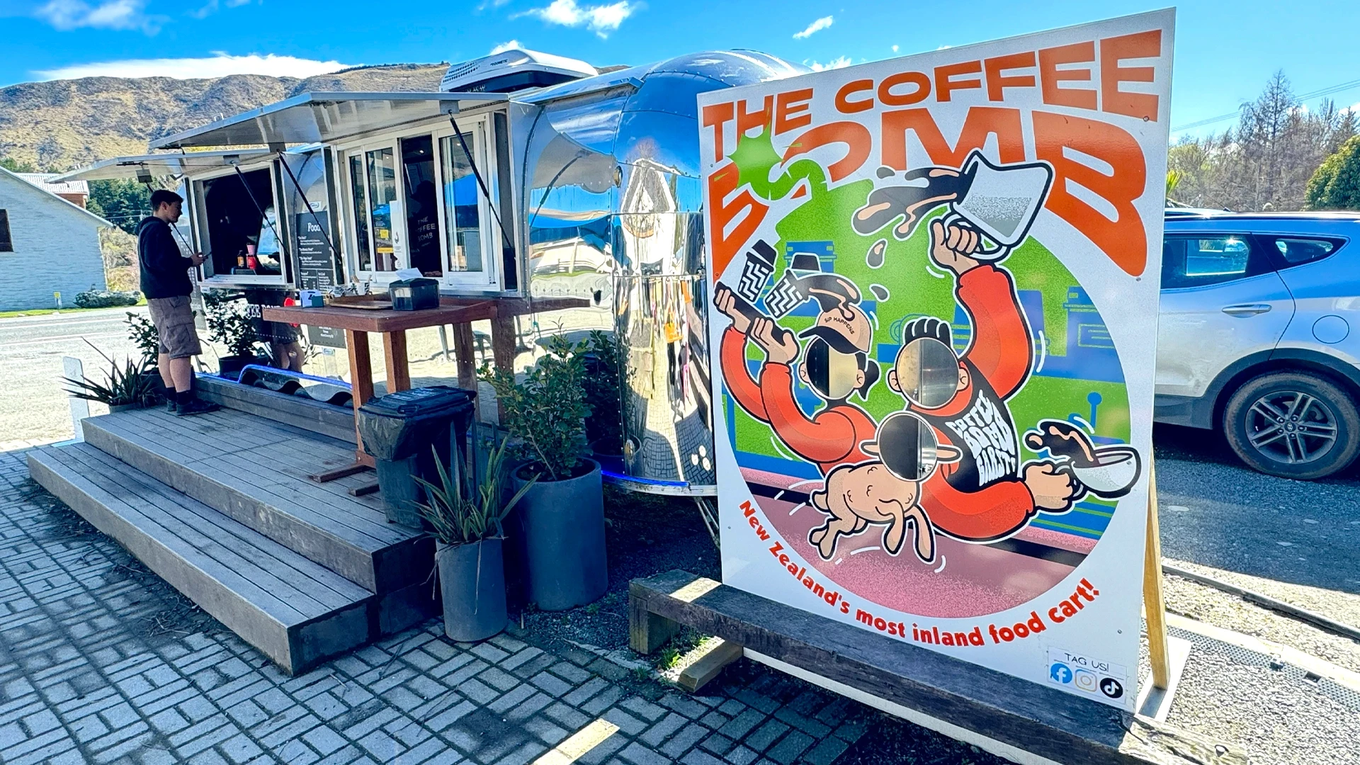
Three faces, one chaotic kitchen: every hole was placed so kids can reach it easily, and none of them breaks the scene.
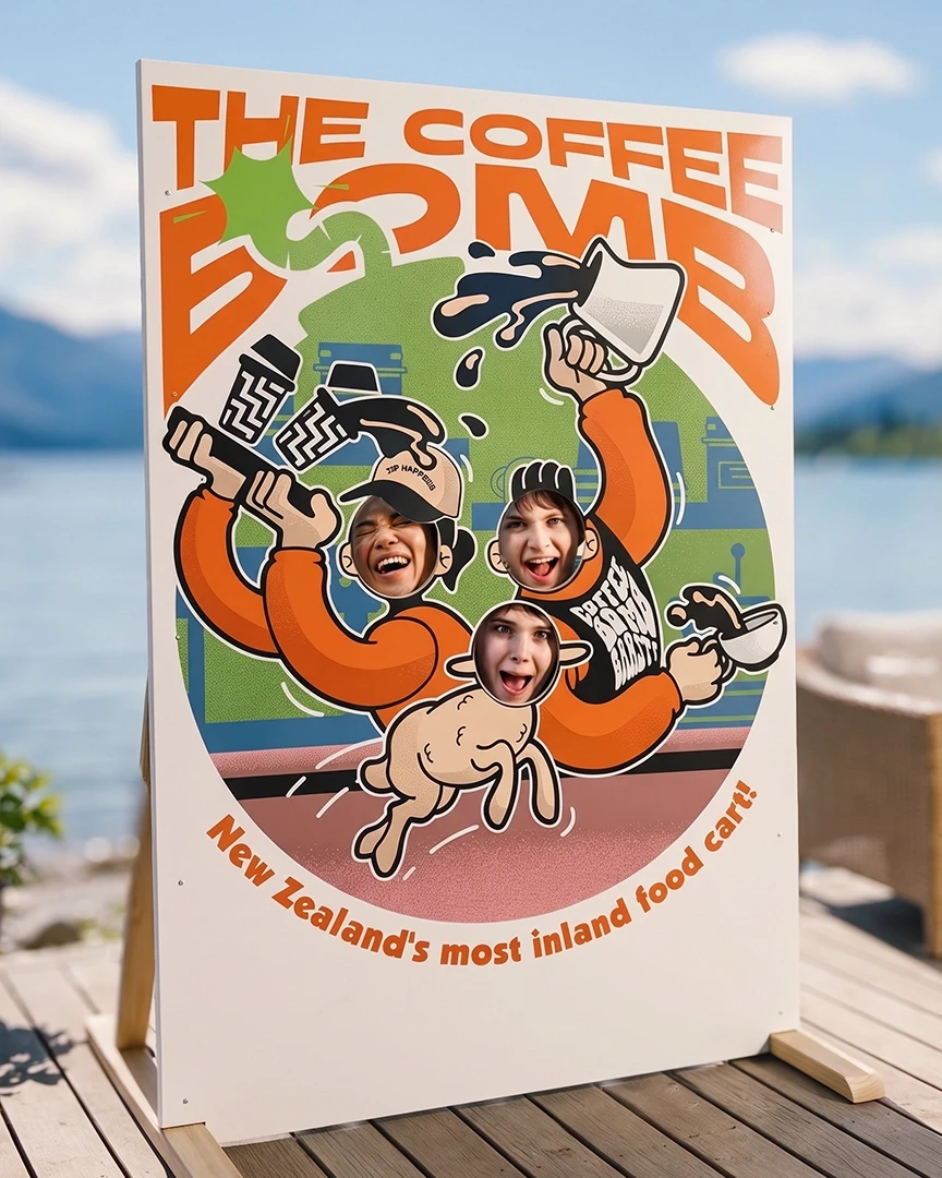
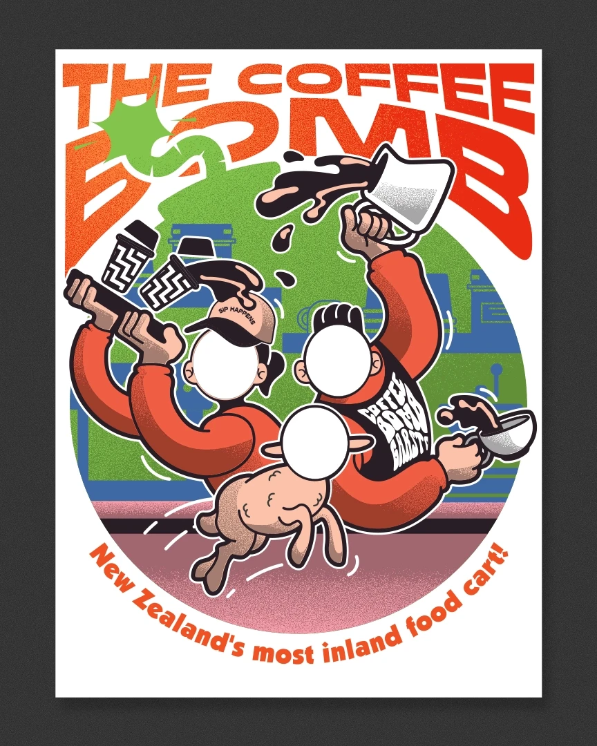
Three faces, one chaotic kitchen: every hole was placed so kids can reach it easily, and none of them breaks the scene.
2025
The Coffee Bomb Standee
Garston, NZ
The Coffee Bomb Standee
A quirky face cutout standee for The Coffee Bomb, a coffee shop in Garston, NZ, designed while I was at Vital Signs. The client wanted something kid-friendly that carried the shop's brand identity in an illustrative style.
Digital Illustration
Signage Graphics
Challenge
Three face holes had to sit where kids could comfortably stand and poke their heads through, without disrupting the illustration. The scene is a chaotic kitchen, so any hole in the wrong spot could break the composition or look like a mistake.
Strategy
I planned the face positions first and built the illustration around them, so each hole lands on a character body or scene element that makes sense. A giant bomb, a nod to the shop's name, acts as a clipping mask for the whole kitchen scene, which keeps the busy artwork contained and gives the standee a strong, recognisable shape. The finished illustration was printed and applied to a 2m-high ACM panel, supported by wooden stands.
Outcome
A sturdy, eye-catching standee that turns the shop's brand into something kids can step into and play with. The chaotic kitchen scene holds together as a complete illustration, and the face holes feel like part of the artwork rather than cut-outs added afterwards.
Gallery
A quirky Standee for a coffee shop
A quirky Standee for a coffee shop
Three faces, one chaotic kitchen: every hole was placed so kids can reach it easily, and none of them breaks the scene.