

2025
McCulloch & Spence
McCulloch & Spence
Invercargill, NZ
McCulloch & Spence
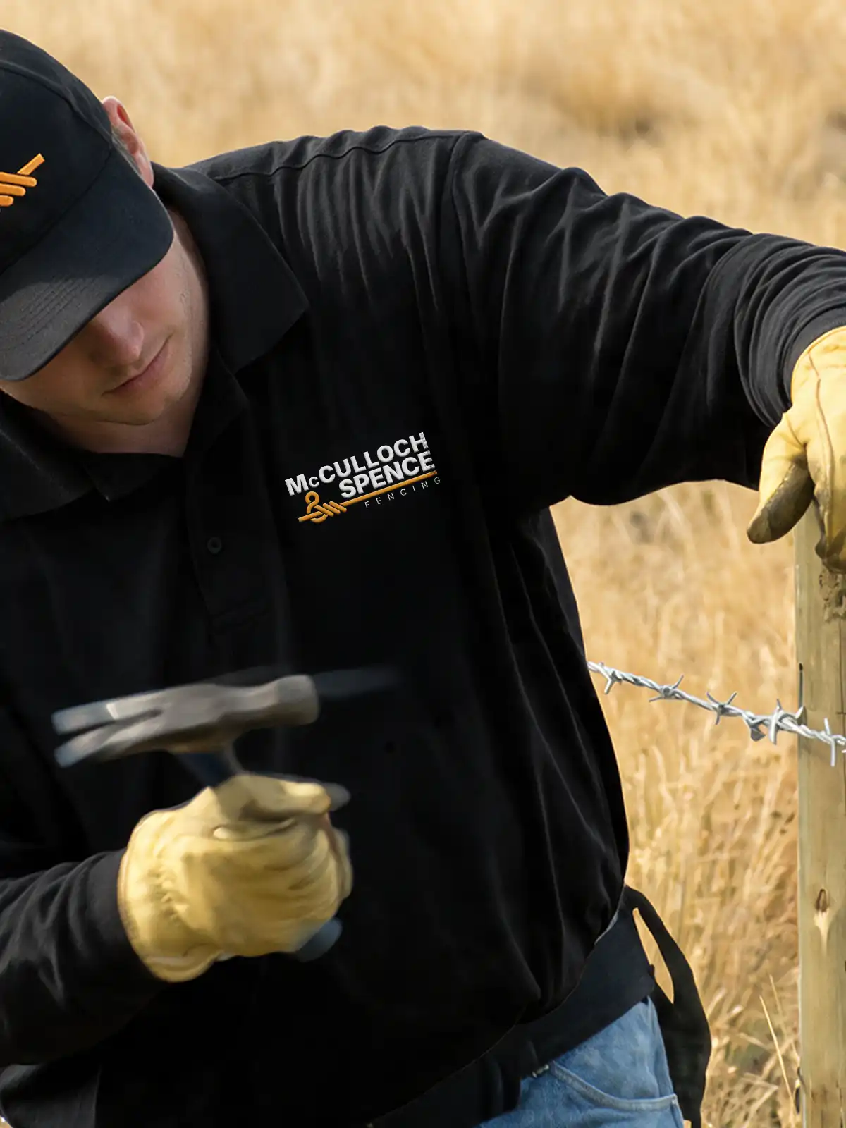
Specializing in rural and paddock fencing, McCulloch & Spence required a professional visual mark that reflected their craft. The resulting design cleverly transforms the ampersand ('&') into a wire fence loop that ties the two partner names together. The identity was seamlessly extended across business cards, promotional stickers, vehicle signage and clothing prints to establish a strong, trustworthy presence across the region.
Brand Identity
Stationery Graphics
Signage Graphics
Vehicle Signage


Challenge
Thomas Spence and Shannon McCulloch approached Vital Signs Invercargill during my time there, to establish a unified brand identity to launch a new partnership between two local fencing specialists. I was tasked with creating a distinctive visual mark that honors rural paddock fencing without relying on overused, generic trade icons. I had to ensure the design scales cleanly across print, stationery, clothing and vehicle applications.
Strategy
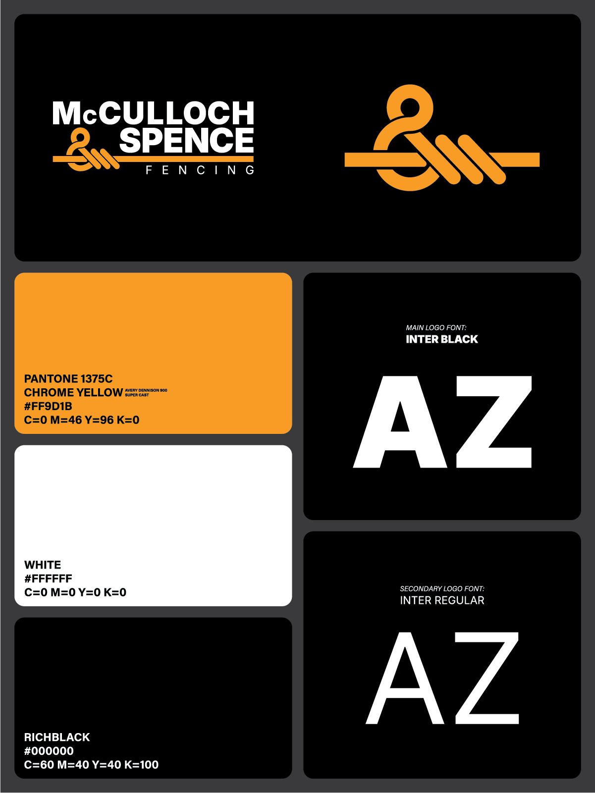
Care was taken for the logomark to not represent separation. Therefore the strategy focused on the ampersand as the central visual anchor to represent unity and partnership. The client wanted a wire fence knot to be part of the logo like their previous one, so the ampersand was stylized to mimic an orange fence knot, subtly embedding the core service directly into the typography.
Application
The logo was designed to scale- a full version logo with both the names of the specialists as the main logo and a logomark as a scaled down version/ app version of the logo for convenient usage. All of the options were created as vectors to ensure flexibility across digital, print, and cut-vinyl applications.
Outcome
The resulting output successfully introduced the new partnership to the local market with a cohesive, memorable identity and a logomark representing unity and strength. We delivered production-ready vector assets for smooth application across clothing and print media, and also applied the graphics onto the vehicles.
Gallery
A new brand identity for two fencing specialists
A new brand identity for two fencing specialists

Where fences separate, the ampersand logomark connects: bringing unity and partnership to the forefront.



Where fences separate, the ampersand logomark connects: bringing unity and partnership to the forefront.
2025
McCulloch & Spence
Invercargill, NZ
McCulloch & Spence
Specializing in rural and paddock fencing, McCulloch & Spence required a professional visual mark that reflected their craft. The resulting design cleverly transforms the ampersand ('&') into a wire fence loop that ties the two partner names together. The identity was seamlessly extended across business cards, promotional stickers, vehicle signage and clothing prints to establish a strong, trustworthy presence across the region.
Brand Identity
Stationery Graphics
Signage Graphics
Vehicle Signage
Challenge
Thomas Spence and Shannon McCulloch approached Vital Signs Invercargill during my time there, to establish a unified brand identity to launch a new partnership between two local fencing specialists. I was tasked with creating a distinctive visual mark that honors rural paddock fencing without relying on overused, generic trade icons. I had to ensure the design scales cleanly across print, stationery, clothing and vehicle applications.
Strategy
Care was taken for the logomark to not represent separation. Therefore the strategy focused on the ampersand as the central visual anchor to represent unity and partnership. The client wanted a wire fence knot to be part of the logo like their previous one, so the ampersand was stylized to mimic an orange fence knot, subtly embedding the core service directly into the typography.
Application
The logo was designed to scale- a full version logo with both the names of the specialists as the main logo and a logomark as a scaled down version/ app version of the logo for convenient usage. All of the options were created as vectors to ensure flexibility across digital, print, and cut-vinyl applications.
Outcome
The resulting output successfully introduced the new partnership to the local market with a cohesive, memorable identity and a logomark representing unity and strength. We delivered production-ready vector assets for smooth application across clothing and print media, and also applied the graphics onto the vehicles.
Gallery
A new brand identity for two fencing specialists
A new brand identity for two fencing specialists
Where fences separate, the ampersand logomark connects: bringing unity and partnership to the forefront.