

2018
Cabot Tech Solutions
Cabot Tech Solutions
Kerala, India
Cabot Tech Solutions
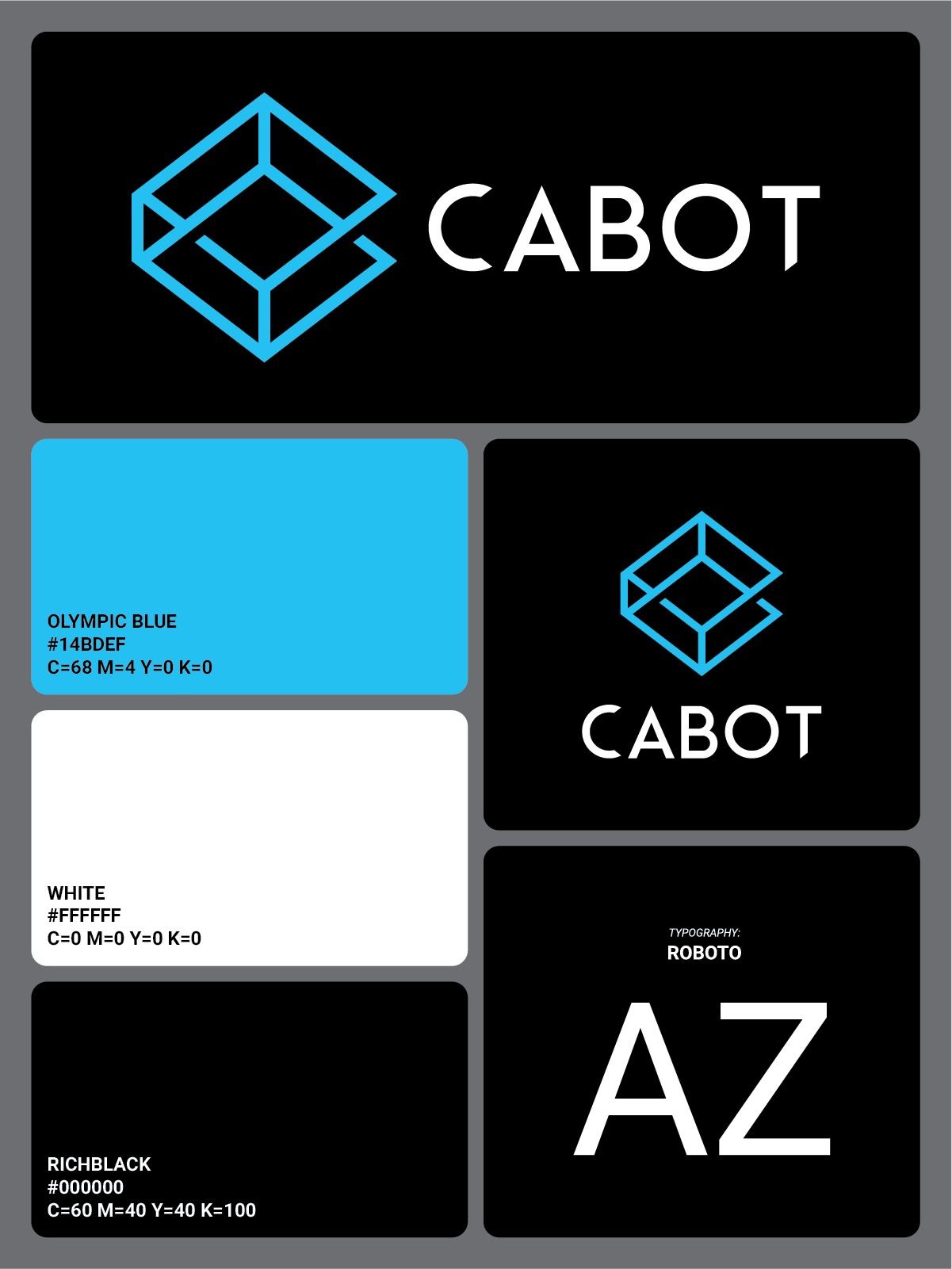
Cabot is a technological solutions company. The brand identity required a design that can capture the company’s open-ended policy to accept all sorts of technological and web related issues and also be multi-platform adaptable. The optically confusing logo that seem to go over and under was made with the idea of the company’s approach to solutions from different perspectives.
Logo Design
Brand Identity
Stationery Graphics


Challenge
When Cabot approached Wowmakers to create a new brand identity, I was required to create the new logo and visual direction for the brand. The main challenge was to capture the company’s ethos to approach a problem from different perspectives and offer end to end solutions.
Strategy
The logo combines the letter ‘C’ with a cube and was designed to be an optical illusion that seem to go over and under, keeping the idea of the company’s approach to solutions from different perspectives in mind. This resulted in a modern and strong logomark and combined with the light blue color scheme, redefined the company’s overall look.
Outcome
The final deliverables included brand guidelines, UI and UX interface design mockups, Event Signage designs, and other stationery designs including employee ID, Business Cards etc. This was the design that got me my very first job, so it holds a special place among all of my design works. All of the attached images are from the first iteration of the brand identity design.
Gallery
Brand Identity for a Technological Solutions Company
Brand Identity for a Technological Solutions Company

The initial 'c' is combined with the 3D appearance of the cuboid to represent Cabot's approach to problems from multiple perspectives


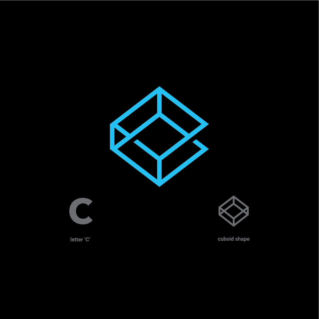


The initial 'c' is combined with the 3D appearance of the cuboid to represent Cabot's approach to problems from multiple perspectives
2018
Cabot Tech Solutions
Kerala, India
Cabot Tech Solutions
Cabot is a technological solutions company. The brand identity required a design that can capture the company’s open-ended policy to accept all sorts of technological and web related issues and also be multi-platform adaptable. The optically confusing logo that seem to go over and under was made with the idea of the company’s approach to solutions from different perspectives.
Logo Design
Brand Identity
Stationery Graphics
Challenge
When Cabot approached Wowmakers to create a new brand identity, I was required to create the new logo and visual direction for the brand. The main challenge was to capture the company’s ethos to approach a problem from different perspectives and offer end to end solutions.
Strategy
The logo combines the letter ‘C’ with a cube and was designed to be an optical illusion that seem to go over and under, keeping the idea of the company’s approach to solutions from different perspectives in mind. This resulted in a modern and strong logomark and combined with the light blue color scheme, redefined the company’s overall look.
Outcome
The final deliverables included brand guidelines, UI and UX interface design mockups, Event Signage designs, and other stationery designs including employee ID, Business Cards etc. This was the design that got me my very first job, so it holds a special place among all of my design works. All of the attached images are from the first iteration of the brand identity design.
Gallery
Brand Identity for a Technological Solutions Company
Brand Identity for a Technological Solutions Company
The initial 'c' is combined with the 3D appearance of the cuboid to represent Cabot's approach to problems from multiple perspectives